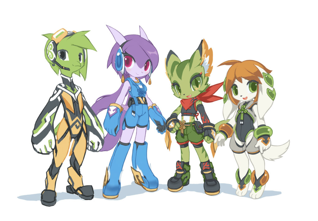
Freedom Planet 1 is an indie platforming action video game released in 2014. I played the game in 2015 and I really liked it. I drew a series of alternative concept arts of the main characters to show my support.
From left to right: Commander Torque the Alien Bird, Sash Lilac the Water Dragon, Carol Tea the Wildcat, Milla Basset the Hound.
Note 1: Freedom Planet 1 was originally a Sonic the Hedgehog fan game. Before the game was transformed into an original IP, it used early versions of the main 3 girls, their original creator was Ziyo Ling.
Note 2: Torque isn’t a bird in the original game. This is purely my own interpretation.
Freedom Planet 1 has a strong Chinese influence on its visual design, so I gave the main girls Chinese style costumes. Torque is an alien, so I gave him a Celtic style costume to differentiate him from the girls. I also streamlined the traditional styles to go with the game’s modern time period and sci-fi setting.
This series of alternative designs were well-received by the Freedom Planet community. The developer GalaxyTrail noticed my version of the girls, and they used them to make a few display boards in video game conventions, among other merchandises. And perhaps because of that, I was later chosen as the character designer of the sequel, Freedom Planet 2.
Freedom Planet 1 website:
Sash Lilac the Water Dragon
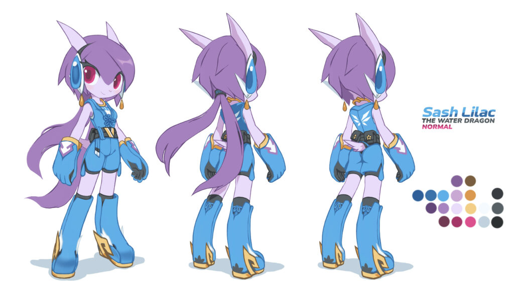
Lilac is the default protagonist of Freedom Planet 1. Her costume doesn’t look very Chinese in the game. Here I tried to use a modernized Chinese clothing style with a flower knot. Lilac is the fastest runner in the game, and she is a very heroic girl. I emphasized her personality by depicting her in a cool and elegant way.
When I was drawing Lilac, I didn’t have a plan to draw other the playable characters in FP1. But the Freedom Planet community seemed to like my Lilac design, so I followed up with other girls and Torque.
I was at the bottom of my low period as an artist (2012 – 2022) at the time. I considered my drawing skill not good enough to have true creative freedom. Not being able to draw a character from different angles was one of my biggest problems. By drawing Lilac’s front view and the rear view at the same time, I must make sure things matches from different angles, and they must also look good at the same time. It was a nice opportunity to study and practice.
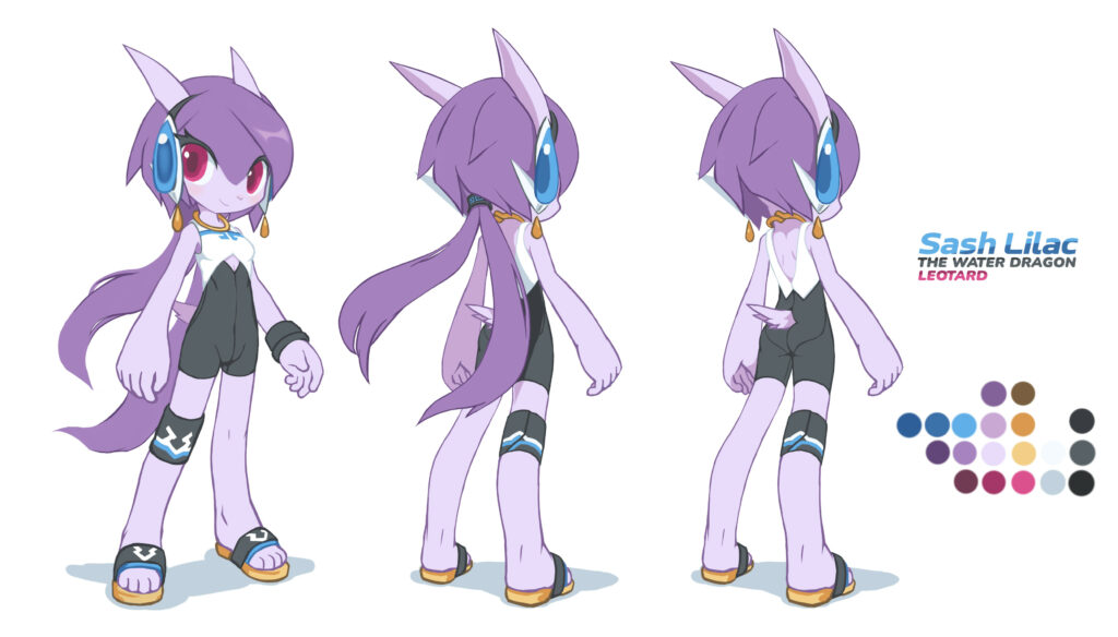
I also prepared a leotard for each girl in this series of concept arts. This was actually an excuse to add some black and white to their costume designs. The girls’ original design consists of very intense colors. It might work as pixel art, but it was too much in HD arts. I added white and black to subdue the colors, which hopefully gave the design a better visual rhythm, too.
I studied Industrial Design in college, so naturally I pay more attention to comfort and modesty in costume design. Since the girls are running and jumping wildly in the game, a leotard as underwear can protect their skins. I took that experience from my daily commute on a bicycle.
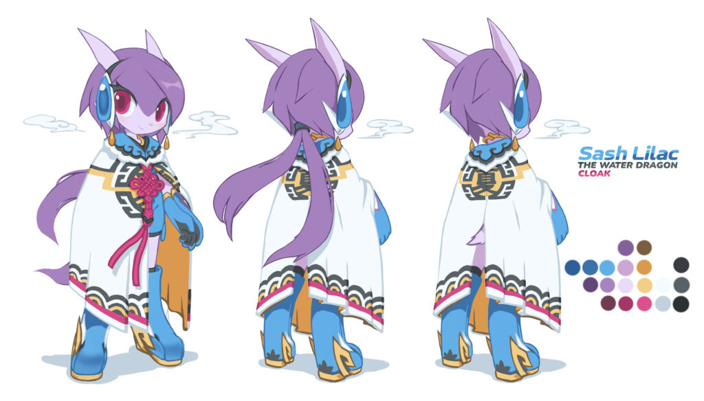
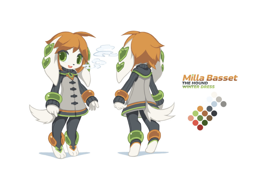
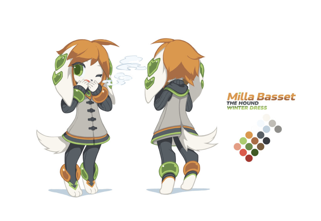
Most platforming action game protagonists are wearing summer costumes, because in this way their actions are more readable and easier to animate. However, I always think it is cruel to let characters to navigate snowy stages in tropical clothing. So this time I also designed winter costumes for them.
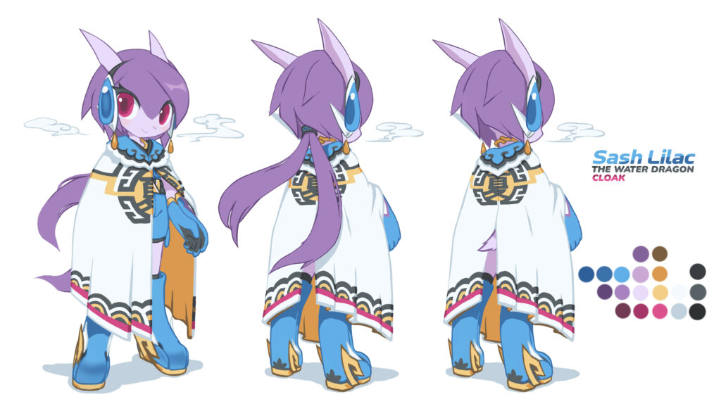
Lilac’s alternative winter costume is a white felt cloak inspired by ancient Chinese army cloaks.
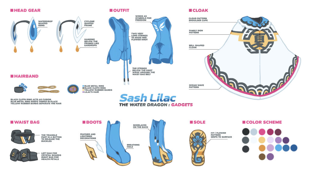
I also prepared descriptions for Lilac’s gadgets, giving each detail a reason to be there.
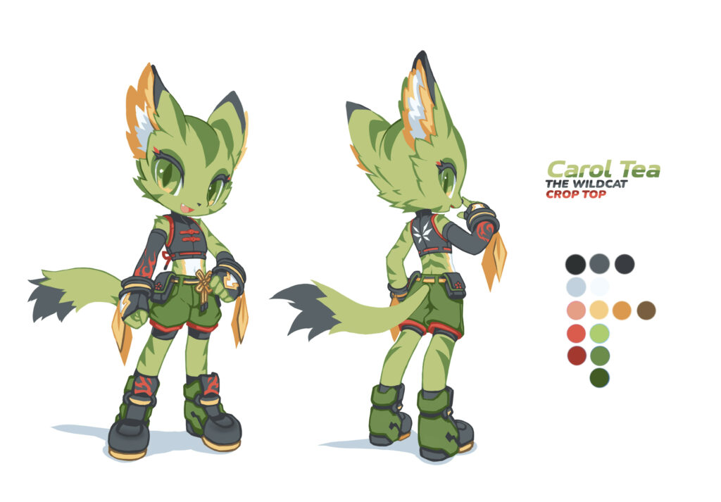
Carol Tea the Wildcat
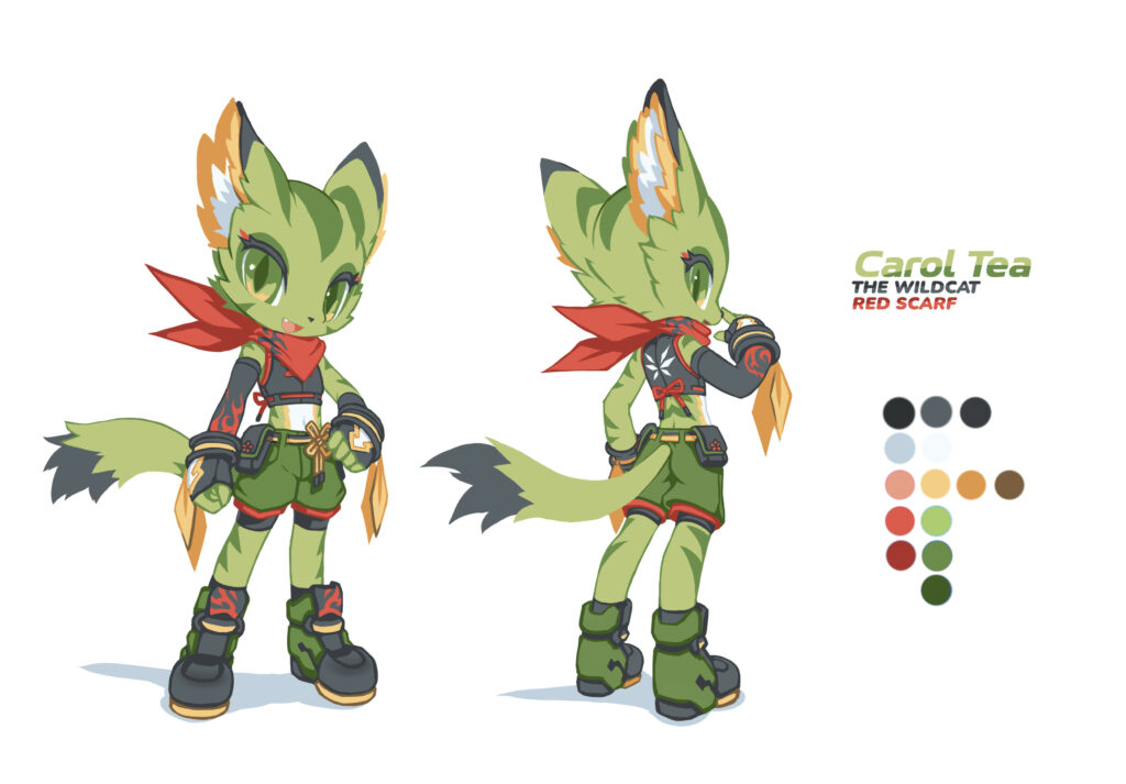
Carol is Lilac’s teammate. She is younger than Lilac, so I made her shorter. Carol is a tomboy, so I used centered knot buttons on her crop top, which is commonly used on traditional Chinese shirts for men. I also added red and yellow details all over her costume to correspond with her iconic red scarf and the yellow fur in her ears.
Lilac and Carol were a team for many years before Freedom Planet 1’s story. For that, I designed their team insignia on their gloves, and the wing marks on their back. I also put the team insignia on the later joined Milla and Torque as well.
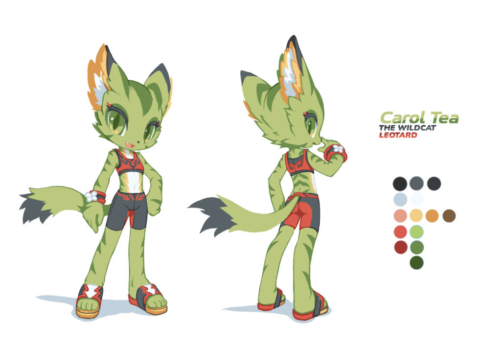
Lilac and Carol’s designs were highly symmetrical. When it comes to simple clothing like leotards, I think a symmetrical design looks too boring. I gave them asymmetrical elements like one-sided knee pad and wristband. I also backported the idea to Carol’s normal costume by giving her a protective sleeve.
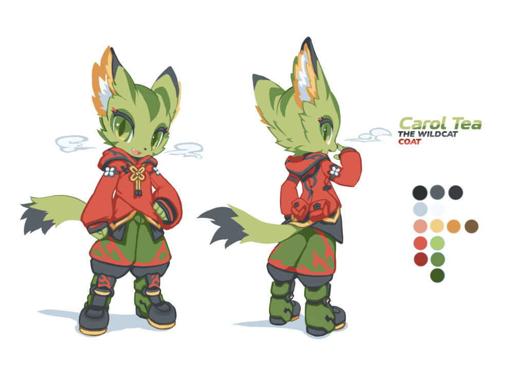
Carol’s winter costume wraps around her neatly, and she looks puffy in it. I really liked the design.
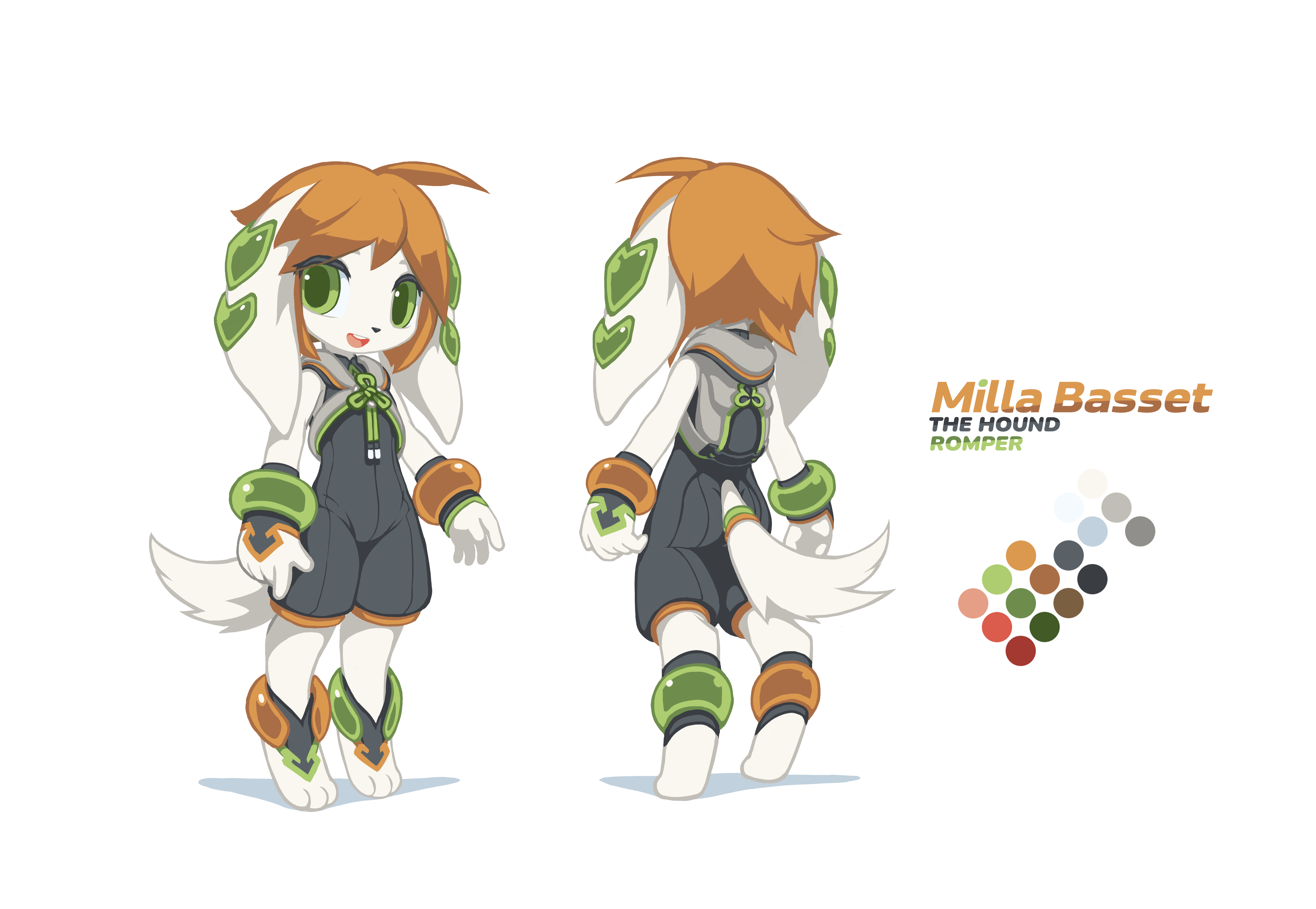
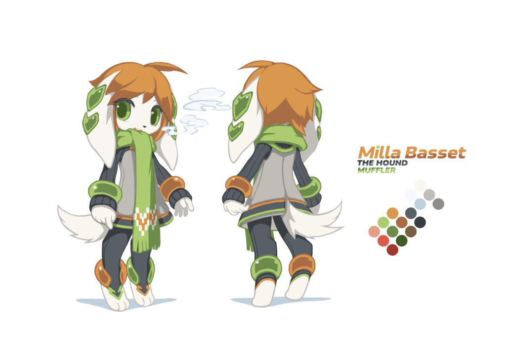
Milla Basset the Hound
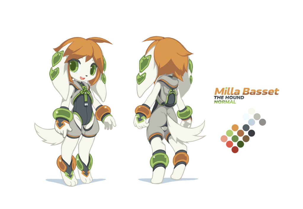
I have a lot of gripes over Milla’s original design in FP1. The alternating asymmetrical bracelets and the green pieces on her long ears are pulling attention away from her face. Combining with the grey outfit and the leotard with the thick, vertical white-and-green stripes, the design was really distracting. Above all, I do not approve how the outfit has holes to expose her inner thighs.
In the alternative version, I first added black details all over her body as visual and physical paddings. This gave the design a better visual rhythm. I replaced the flashy leotard with a black one, and added a green flower knot on her chest to draw attention back to the center.
I also added a backpack to the outfit to hold her belongings, because she was “a stray dog” before meeting Lilac and Carol. A backpack would help her carry her stuff around.
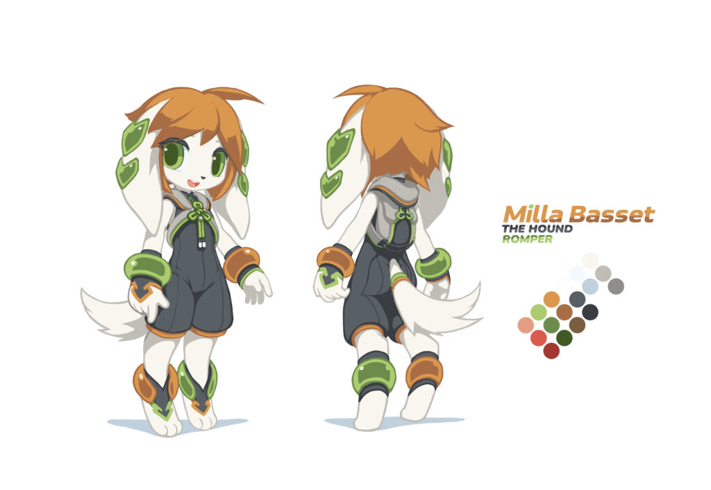
Milla’s normal costume needed to be similar to the original, so I kept the questionable structure there. But since Milla was too young to wear a revealing costume, in the next alternative design, I replaced the inappriate part with a black romper. This later became the base of Milla’s Freedom Planet 2 design.
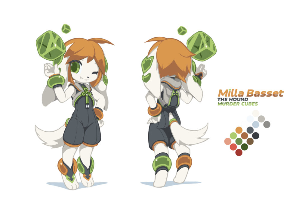
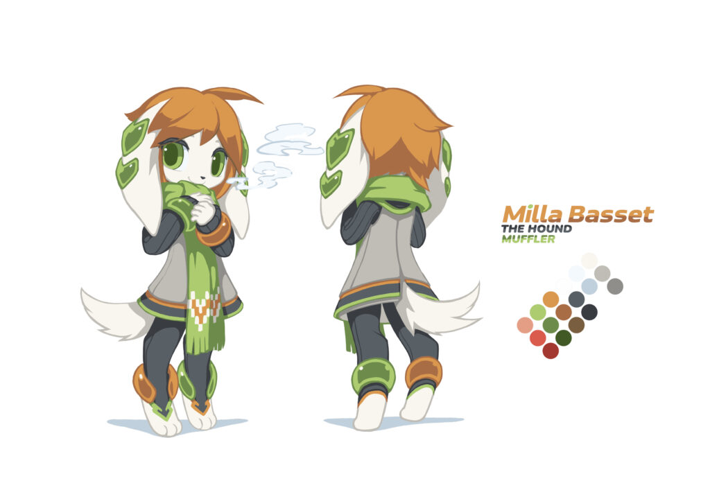
My attention was changing on the course of drawing this series of FP1 characters. When I was drawing Lilac, I paid attention to the design language, trying to find a way to transform the original design into my typical style. When it was Milla’s turn, I began to pay more attention to the expressions and gestures — I wasn’t good at them, either. As an art exercise, I gave Milla an extra expression and pose for each costume.
I had an obvious bias for Milla when it comes to drawing Freedom Planet related stuff. On one hand, it could be that the smallest kid gets the all the love from their parents — I always saw Lilac as the otherworldly cool classmate, Carol as the annoying, rebellious younger sister, and Milla as the smart and well-mannered little daughter. On the other hand, Milla has the most anime-styled hair and facial structure, maybe it was easier for me to draw her than others. In a long period of time, I experimented many ideas of how to draw better faces with Milla as a base model.
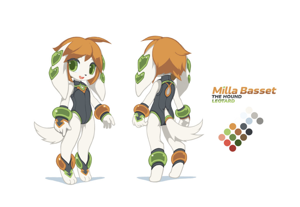
Milla’s leotard is a part of her “normal” costume. It has nothing to do with her other alternative costumes.
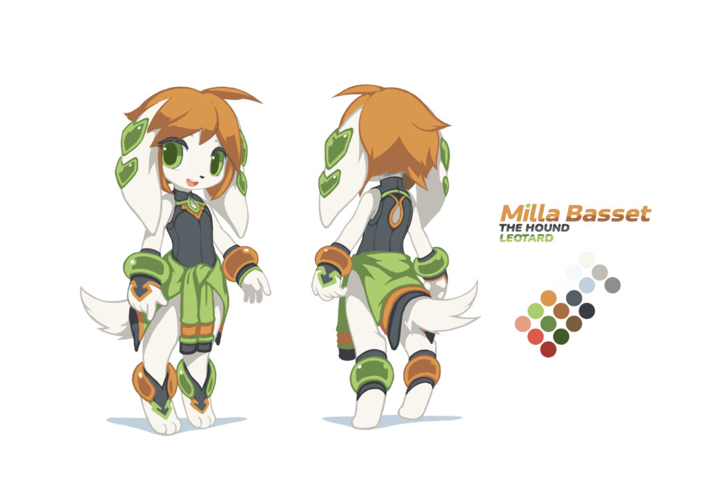
I really liked this costume combination with Milla’s outfit tying around her waist. She looks sporty like this, and the color looks nice too.
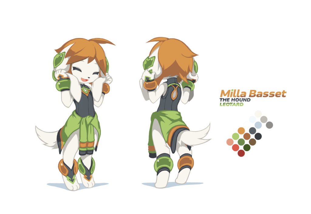
This one is my favorite. Milla’s expression and pose looks cute and natural, which was not something I could reliably do back in 2015.
Commander Torque of the Chasers
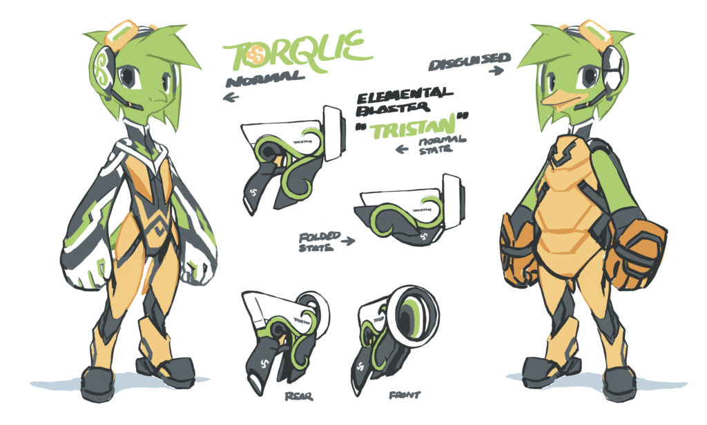
Torque is an alien commander from the Chasers which is at war with FP1’s final boss Lord Brevon. He was supposed to be a playable character in a DLC, but the idea was later cancelled.
Torque’s voice actor P.M. Seymour is an Irish descent, so I used Celtic style ornaments, like the triskelion, on his costume to differentiate his culture background from the girls’. His costume also looks more Sci-Fi, because he is supposed to come from a more technogically advanced civilization.
Torque isn’t a bird in the original game, he looks more like a green skin human. I thought he looks out of place when standing next to animal-based girls, so I turned him into a bird.
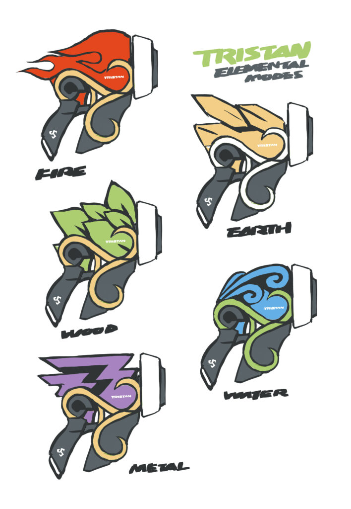
Tristan is a name related to Ireland from the legends of King Arthur. Here it was used as the name of Torque’s blaster. The elemental pickups in the game were supposed for Torque to change his weapon type. I designed a unique look for the blaster with each element.
Conclusion
Drawing this series of pictures was not a small feat. I treated it as an opportunity to practice my art skill.
At the time (2015), I was at the bottom of a low period (2012 – 2022) as an artist. I couldn’t handle body proportion, anatomy and facial structure very well. I drew eyes way too big, except for Torque (perhaps because he was the last I drew in this series). The anatomy was also indecisive between the Sonic style and a generic style. The only saving grace being the designs still look serviceable for some reason, so I decided to keep them in my gallery.
I also set many arbitrary rules for myself at the time. I did not use layers to mix the colors, but instead only chose colors manually to train my color sense (I’m still using this method most of the time). I used a near flat color instead of full shading to pay more attention to the shapes. I used colored lines instead of black lines to pay more attention to the colors. All of those stunts were desperate measures, hoping to do something about my failing art skills. They might have some positive effects, but I think they did more harm than good because they distracted me from the drawing process. I gave up this coloring style soon after.
Not only that, Krita’s text tool in 2015 was basically unusable. There weren’t many free and open source fonts to choose from, either. Because I refused to use any proprietary software, I was unable to put texts in my pictures gracefully. I could do the text in GIMP, but exporting files back and forth between GIMP and Krita was unbearable. Most online platforms did not allow mixing texts and pictures like what I did in this post. I had to combine everything into a single picture and shrunk its size before posting them. On top of that, I kept telling myself that people wouldn’t care about what I had to say, because my art sucked. So I never wrote down what’s in my mind.
All things combined, these alternative FP1 concept arts were once showcased under very unfavorable conditions. I disliked them so much to the point that I once removed them from my gallery. But when I look at them again one by one in 2024, they weren’t so bad as I remembered. I could feel the overwhelming love I put into each design. Now that I see art as a means of communicating ideas, I decided to use every means possible to explain my design. This is to respect my audience, and to respect myself, as well. Therefore, I spent days in Krita to rearrange the pictures and give them better typography — Krita now has a usable text tool, and we have many free and open source fonts to choose from. I also prepared a transparent version of each picture so people can use them easily as they see fit.
Leave a Reply