This is the splash art I created for Krita 5.3.0 / 6.0.0, aiming to depict a refreshing and pleasant summer seaside scene. This article details my thinking process and design concepts, offering practical insights for new artists.
Krita is a free and open source digital painting application. Kiki the Cyber Squirrel is the mascot I designed for Krita. I also maintain Krita’s simplified Chinese translations — across the app, documentation, websites, and more.
Krita website: https://krita.org/
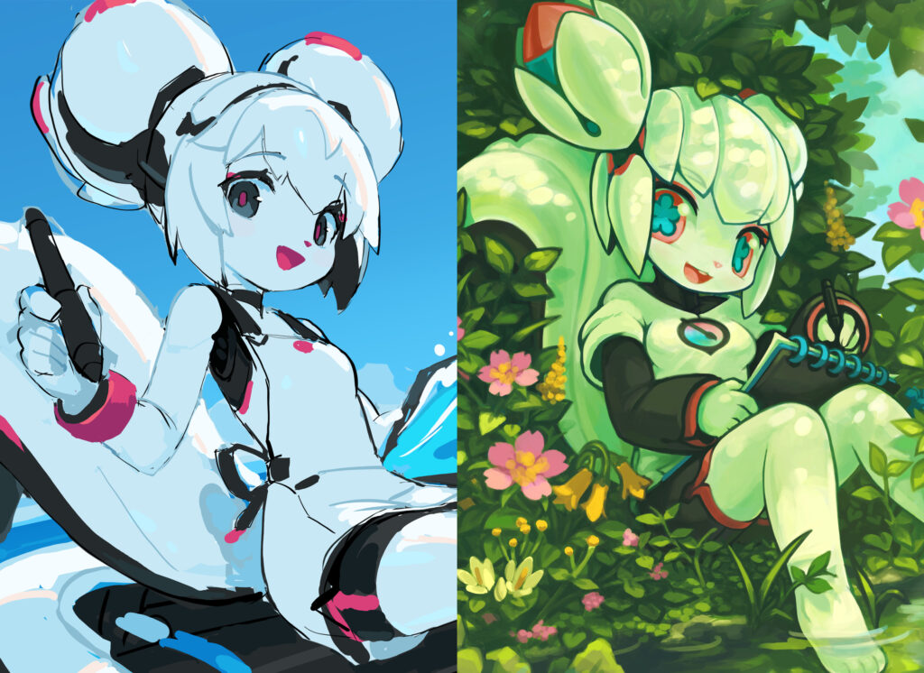
Other versions of Kiki
- Kiki the Cyber Squirrel: mascot of digital painting app Krita (this page)
- Kiki: support character in Electric Hearts, Sunset Era
- Kiki: support character in Spirit Animals in Disguise
- Kiki the Robot Squirrel: support character in Electric Hearts, Evernight Era
- Connections between Electric Hearts & Spirit Animals in Disguise
- Characters based on my FOSS mascots

Planning
The working file of this splash was created in August 2025, and I completed the draft the same day. Although sketchy and lacking detail, the overall appearance — especially when zoomed out — already closely resembled the final product. This might have been the first time I truly planned my composition in advance — and largely stuck to that plan.
During the planning stage, I aimed to re-challenge a few shortcomings in previous splashes. I will explain these aspects in later sections:
- 2024 splash’s messy mech details and vague structures
- 2021 splash’s ambiguous lighting and distractive background
- 2019 splash’s artificial color choices and unclear theming
After finishing the draft, however, I lost motivation to continue — perhaps because the early design stage allowed for free exploration of ideas, while the refinement stage was basically tedious work and thus not as engaging.
I also aimed to raise the quality bar: using finer, more controlled lines and cleaner colors to match the style of an artist I was studying at the time. Although my detailing skill was gradually improving in early 2025, I had no clear sense of how far to push — or how difficult it would be. That uncertainty revived memories of past failures, when my drawings consistently fell apart during refinement — and reignited my fear of the challenge.
So I set this piece aside and and turn my attention to Libbie’s 2025 design and several new FOSS mascot requests. During that process, the art style I previously envisioned slowly took shape. By the end of 2025, I also began practicing pencil drawing, which strengthened my ability to translate ideas onto paper — and boosted my confidence as a result.
In February 2026, the release of Krita 5.3.0 / 6.0.0 was imminent and the new splash could no longer be delayed — so I focused my energy and finished it in a few days, using 2025 Libbie’s art style. Compared with the draft, the major changes were Kiki’s design details and the depiction of seawater.
Character Design
In the previous splashes, Kiki has always been dressed in layers of warm and puffy costumes. This time, I wanted to do something different and have her wear something cool and form-fitting.
In my early works, I tend to emphasize the muscles and the volume of certain parts of the body, thinking those represent “good anatomy”. But the artist I was learning from at the time can use relatively straight lines and flat forms to achieve a very good impression. So I wanted to challenge myself to achieve a similar effect.
Kiki’s figure in this version has been adjusted to be “flatter” than before, while the bone points at the shoulders, chest, hips and knees are more clearly defined than my previous works. The combination of softness and hardness can form a visual rhythm, and the clear structure can make the character appear more substantial.
During the draft stage, I originally intended to draw Kiki’s hairstyle based on her 2014 – 2016 designs, but the casually drawn small strands of hair happened to look “natural and organic” and I really liked it. However, when it came to detailing, the random and fragmented hair details felt too “basic”, so I reshaped it into her 2020 – 2024 hairstyle.
I was not quite satisfied with the overly busy and random mechanical details in the 2024 splash. Therefore, this time I toned it down quite a bit, leaving continuous large areas of smooth surfaces and uninterrupted lines flowing throughout Kiki’s body, which work with the occasional complex parts to create a visual rhythm. The sub-dividings within each color have also been designed in a more organized manner, which led to better perspective and volume. Overall, it was a transition to a more restraint, thoughtful and organized detailing style.
However, I still intuitively like Kiki’s draft hairstyle better. Perhaps the original hair direction functioned as part of the draft’s composition. Major changes to character design in late stages led to unpredictable consequences, making the result less consistent as a whole. I shall pay more attention to this aspect in the future.
Finally, when stitching the above comparison pictures, I felt that I had drawn too many instances of Kiki with similar angles and poses. As splash arts, they inevitably share commonalities in terms of horizontal composition, expressing the nature of the software, and encouraging artists to create, but still, recasting the same idea over and over again does not feel like true “creative freedom”. Therefore, I hope to try something different in the next splash.
Lighting Design
In terms of lighting design, the 2026 Kiki re-challenged the 2020 version‘s failed main objective — backlighting. Not the typical kind with a strong light source blocked by the subject in darkness, but a subtler outdoor version: on a sunny day, with the sun high and behind the subject while out of frame. Most of the subject falls in its own shadow, softly illuminated by blue sky light. When executed well, this lighting can bring a clean and refreshing effect.
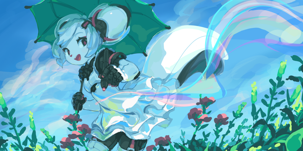
The 2020 Kiki began as a study of Monet’s “Woman with a Parasol”. In the draft stage, the lighting was straightforward — but later, I decided to render Kiki’s white material semi-transparent to emphasize her “artificial” quality. This change disrupted the original lighting design.
The colorful background clouds were meant to establish a concept connection with Krita’s color selector, but their visual distractions weakened contrast between character and background. Here, I’ve made the mistakes of prioritizing literal concept over visual effect — and deviating from the plan impulsively. These were indeed valuable lessons.
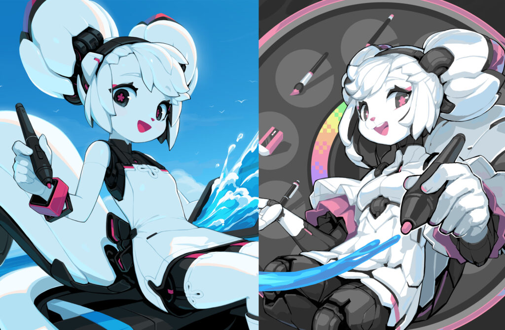
This isolated 2026 Kiki character layer was expanded upon the request of the Krita team, completing the upper part of her ears. Removing the sky background reveals that 2026 Kiki is mostly light blue. Color perception depends heavily on contrast and context: against a matching sky-blue background, she still appears as white.
I have long pursued this ambient-light shadow style. In the early days, I likely first saw it in inspiring artworks online — and perhaps adopted it also to prove myself by using something more “advanced” than basic greyscale shadows. Kiki’s primary color is white, so her shadows appear blue under the sky and green in a forest. But in my early pieces, I handled these colors poorly, leading some to mistake her base color for blue or green. The 2026 version handles this far more effectively.
Background Design
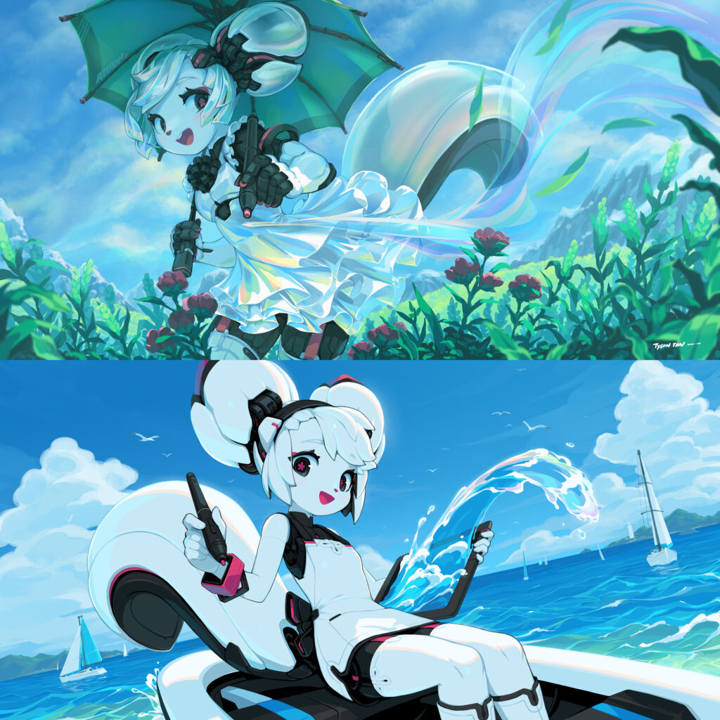
In terms of theming, the 2026 splash was a re-challenge of the 2019 version.
I have always been dissatisfied with the 2019 splash. It was supposed to be a sea view, but I chose to stage it on top of a seaside hill, far away from the water surface. The key elements of the sea exist as concepts, but they have no substance. The color selection was also problematic — too saturated and abstract. At first glance, one can “understand” the elements in the scene, but unlikely to actually “feel” them.
In the 2026 splash, I staged the scene directly on the sea surface. The sea elements: water, waves, clouds, seagulls, boats and islands are clearly depicted. I also chose a more realistic color palette than the 2019 version, with blue as the dominant color with vivid contrast within itself. For some reason, this has some early 2000’s Fruitiger Aero vibes!
I painted the sea water largely based on my impression of the clear shallow sea, aiming to create a sense of transparency, volume and movement of the waves. The water consists of flat color blocks on a single layer. I didn’t even look at any reference photos — everything was hand-painted with intuition. Surprisingly, the final result turned out to be fine.
For many years, I have been using the same simple approach — each part on a single layer, a small number of colors, and paint everything manually. It went through a few stages of development:
- At first, it was mainly for “cheating” — merging the layers at the final stage to allow easy usage of liquefy transform tool to correct proportional problems.
- Later, I found out that to change the character design halfway, painting over a merged layer is far more intuitive and efficient than switching between multiple layers.
- Later on, I began to use Krita, but the early versions were too slow and unstable, forcing me to use fewer layers, no fancy blending modes, and relied on mostly hand-painting to avoid problems.
- Finally, after drawing like that for a while, my perception of colors improved, and the colors mixed by layer blending began to look dirty. I opted to hand pick all colors, and thus my later works tend to have a smaller number of colors.
The 2020 Kiki splash was an extreme case of this approach. The water part in this version was inspired by the following:
- A sample artwork of “Koi carps fighting for food on the water surface” from a certain art textbook
- Claude Monet’s works
- Pointillism
I can no longer recall from which book I saw the Koi artwork — but it was impressive enough for me to remember it after so many years. The artist used only a handful of colors and skillfully organized shapes to convey a lively scene. Claude Monet’s use of colors strikes an excellent balance between realism and impressionism, and has always been my role model. The Pointillism school inspired me to use fewer colors to make the picture cleaner and more vivid.
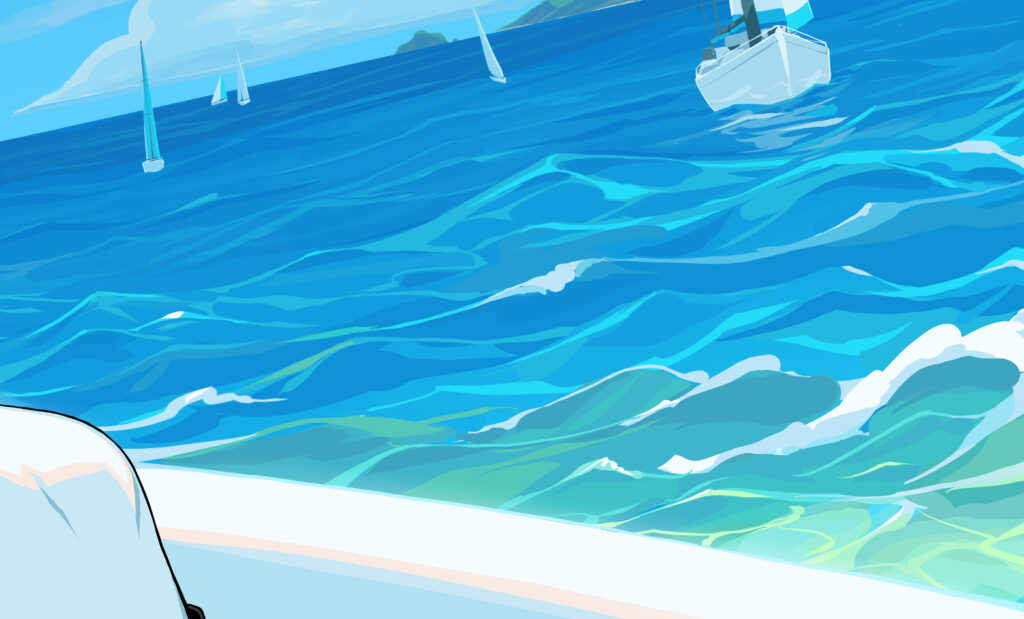
When I was painting the water near the bottom of the picture, I was struck by a random idea to gradually change the water color from blue to green to mimic the effect of sunlight in shallow water, so the water feels clearer. I didn’t think of this during the draft stage — sometimes deviating from the plan can lead to a pleasant surprise!
While writing this article, I wondered where this sea water color intuition came from — after all, I didn’t remember ever seriously painting the sea. Perhaps when I was creating the 2019 splash, I chose a place far away from water because I didn’t believe I could draw water properly.
At last, it finally dawned on me — this must be the experience I gained from drawing pixel art backgrounds for Freedom Planet 2.
Echoes from Parusa
Freedom Planet 2 is an indie action platform game that I participated in its development. Among all the pixel art backgrounds I designed for the game, the sea water at the left side of Adventure Square of Parusa looks the most similar to the 2026 Kiki splash’s approach.
The shallow water near the beach under the Floating Island of Parusa has a blue-teal-green grading, which is also quite similar to the 2026 Kiki splash’s water.
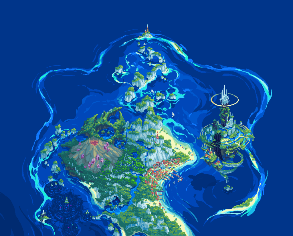
The same water approach also appears everywhere in Parusa’s overall map.
When drawing background assets for Parusa, I referenced a large number of tropical photos, so my intuition about sea water colors was not out of thin air. At the same time, pixel art naturally limited the number of colors available, and did not allow smooth gradient or complex inter-layer color blending. These restrictions in turn honed my ability to use colors.
Looking back, working on Freedom Planet 2 was a very creatively rewarding experience. FP2’s main creator Sabrina gave me enough creative freedom to experiment ideas. I drew many things that I had never drew before, challenging my weak aspects, finding new solutions for difficult matters. These 7 years played a crucial role in my growth as an artist, and helped me to improve quickly since 2022.
Although it has been years since I participated in Freedom Planet 2’s development, and the memory is starting to fade, the experience still lives in the form of artistic intuition – it truly shows that nothing is ever done in vain.
Perhaps the sea Kiki is sailing in the 2026 splash is somewhere in Parusa!
Source File and Some Thoughts
Source file: Download
Before writing this article, I had already posted this image and its source file on the mascot section of the Krita official website. Some people accused me of merging the layers before releasing it — making them unable to extract line art, blending modes or filters, to prevent them from learning my “secrets”.
If you have read up to this point, you should understand that’s just how I create — each element on a single layer, hand picked colors, full hand-painting. I hope that through my introduction, beginners can get some inspiration — art doesn’t have to rely on complex software functions or even be completely outsourced to external tools — it can be done with a small number of colors, simple shapes, using your own hands. The artist should be responsible for every creative decision, controlling each detail and what ideas to convey. The more involved you are, the faster you can improve, and you should have more fun as well.
I share my source file to allow everyone to study and modify them. I believe this is inline with the spirit of Free and Open Source. A few years ago, I tried to attach links to the source files when posting arts on social media, but unfortunately the platforms shadow banned me because of that, so I had to stop. Now with my own website up and running, nothing can stop me sharing them with the world.
Still, preparing a presentable source file needs requires extra effort. If it weren’t for public release, I would definitely be more sloppy about the layer names, transparency holes and missing contents in overlapping areas.
As long as the website’s bandwidth allows, I will continue to share my source files. If the bandwidth ran out, I will consider uploading them to some cloud service instead.
Leave a Reply