In this post, I explained how I designed the main 4 characters of Freedom Planet 2, an indie platforming action video game.
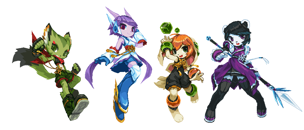
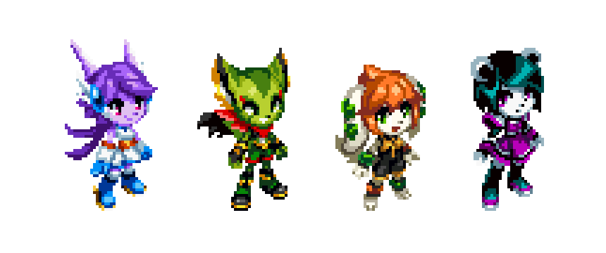
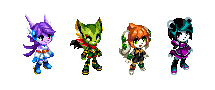
From left to right: Carol Tea the Wildcat, Sash Lilac the Water Dragon, Milla Basset the Hound, and Neera Li the Panda. For the box art featuring these characters, see: Freedom Planet 2 Box Art.
Note: Lilac, Carol and Milla are the playable characters from Freedom Planet 1. FP1 was originally a Sonic the Hedgehog fan game. Before the game was transformed into an original IP, it used early versions of the main 3 girls, their original creator was Ziyo Ling.
The Freedom Planet franchise has a strong Chinese influence on its visual design, so I gave the characters Chinese style costumes. I also streamlined the style to go with the game’s modern time period and sci-fi setting.
Freedom Planet 2 websites:
Getting in Touch with GalaxyTrail
I played Freedom Planet 1 in 2015, and I really liked it. I drew a series of alternative concept arts for the main girls (only 1 of each is shown here), and they were well-received by the game’s community. The developer GalaxyTrail noticed my version of the girls, and they used them to make a few display boards in video game conventions, among other goods. I think that was the moment we got in touch with each other.
As Art Consultant of Freedom Planet 2
Freedom Planet 2’s development started in 2014, I wasn’t part of the team from the beginning. When the first batch of concept arts for the game were created, the main creator Sabrina contacted me for possible suggestions.
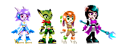
Above are the early character sprites Sabrina sent me at the time. Sprites are low resolution in-game pixel arts. They are supposed to be animated, so the player can control the character to perform all sorts of actions.
I had no idea at the time that I would later become Freedom Planet 2’s character designer. I positioned myself as a consultant, and tried to keep the original color blocks as much as possible. My idea was to make them look more appealing, and more belonged to the Chinese inspired setting, by adjusting only the details.
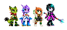
Above are the near final sprites in 2017. The first version I sent back to Sabrina at the time should be flatter and sketchier. Since I didn’t start anew on the designs, there were compromises. If I were to handle their designs from the beginning, I most likely would have given the girls completely different colors, hairstyles, and costumes.
Solving the 3/4 Front View Tilting Problem
Most side-scrolling games tend to draw their characters in a dead-lateral view. To make the characters look more appealing, we decided to use a 3/4 front view instead. This approach, however, has a pitfall — even when both eyes were at the same height and size, the further eye would look larger; even when both shoulders were at the same height, the closer shoulder would look droopy. A lot of games were plagued by this issue to different degrees. This problem is less obvious at smaller pixel sizes, but very pronounced at Freedom Planet 2’s character size.
You can clearly see this effect in the early 2015 sprites. The characters look as if their heads were tilted, and they were raising one of their eyebrows. Their standing postures also look droopy and weird.
My theory is that the brain expects perspective shortening when an object is facing the viewer with an angle. In normal life, the further side of an angled object looks smaller, while the nearer side looks larger. To compensate the perceived size difference, the brain adds weight to the further side, so we perceive both sides to be “of the same size”. But when it comes to pixel art, things are often aligned perfectly. The brain over-compensated the further side, making it appears to be larger, so the object feels “tilted” as a result.
Note: I didn’t look at any other game for reference when I was working on Freedom Planet 2. The examples above were collected in 2024 when I was expanding this post in 2024.
Mega Man X (the blue character) used a near side-view approach. By not drawing the other half of his face, the tilting problem was avoided. This is a typical approach of many games from the same genre. However, the X1 – X3 sprites didn’t take the legs into consideration. X’s closer knee looks lower, and the closer leg as a whole looks kinda weird. The X4 – X6 sprites solved this issue by enlarging the closer leg significantly. Mega Man 7 used the 3/4 front view approach, but they didn’t handle it very well. The franchise never used 3/4 front view in later games.
Shantae (the purple hair character) used a typical 3/4 front view approach. The one on the left is a sprite from Shantae and the Pirate’s Curse. Because the game used small sprite sizes, the artist likely could not reduce the further eye’s vertical size. They instead expanded Shantae’s closer eye horizontally, overlapped her head tuft with her eyelashes, obscured her further shoulder with her body, lowered her further hand by 1px, etc. The tilting was reduced significantly as a result, and I guess Shantae’s hairstyle might have a purpose in countering the tilting problem from the beginning. The middle and right ones are my attempts on a Freedom Planet 2 style Shantae, just for fun.
When comparing Milla’s first and final sprites side-by-side, the tilting on the first draft gets really obvious.
To prevent this from happening in Freedom Planet 2’s character sprites, I used the following visual tricks when needed:
- Lower the further eye by 1px. All body joints were adjusted likewise.
- Make the further eye 1px smaller than the nearer eye, both vertically and horizontally.
- Dim the reflection of the further eye by 1/4.
This achieved a pseudo 2-point perspective effect within the limited pixel size, and the final sprites look more natural as a result.
As Character Designer of Freedom Planet 2
Freedom Planet 2 only had 3 playable characters at the beginning. Neera the Panda was an unfriendly character from the previous game. The main creator Sabrina liked the new sprite I did for Neera very much, so she decided to make her playable as well. Soon after I worked on the first sprites, Sabrina assigned me as the character designer of Freedom Planet 2.
Freedom Planet 2 is a pixel art game. To make sure the characters look proper in game, I always design their in-game sprites first, and turn them into HD arts later (if necessary). This was complete opposite to how art design works in normal game development. I think I was able to do this because Krita, the art application I used, allowed me to do quick adjustments on pixel arts. This reduced my workload significantly, which I really needed. At the time I was in the middle of my low period as an artist (2012 – 2022), I could not draw good HD art reliably. I felt more confident when drawing pixel arts. So that might also be a reason for me do use this approach.
As I became more and more experienced in pixel art, the sprites of the main characters also received overhauls. Lilac’s sprite animation project started earlier than other girls, so I could not change her sprite design too much. Milla, on the other hand, received a nearly complete redraw with extra details backported from her HD arts.
From Character Designer to Whatever Designer
The Freedom Planet 2 team was skeletal and loosely organized, consisted of remote-working freelancers. We were always all hands on deck, everybody does whatever they could.
Although I was nominally the character designer, I actually designed all kinds of stuff for the game. I ended up designing the visuals for over 100 characters, a lot of the enemies, almost all bosses, all hub towns, all overworld maps, many stage background elements, various small items, and even some UI elements.
Note: animations and extra shadings are done by other team members. I only provided designs for the base frame(s).
Working as a Volunteer
I worked on Freedom Planet 2 as a volunteer, and it was purely my own decision.
I have a day job, so I could only work on the game in my off time. I had zero prior experience on game development. My art skill was shaky at the time, and I had severe self-doubt. All matters combined, I worried my involvement might have a detrimental effect on the game. And because I have a stable income and didn’t need the extra money, I offered to work for free, so the money can be used to hire more people.
As a long time volunteer on the free and open source software scene, contributing my skills for free is just part of my everyday life. I also have no problem helping friends to finish a passon project. If nothing else, I see this experience as part of my spiritual journey.
HD Arts Version 1
In late 2015, the first version of the new character sprites are ready. I then created some HD arts based on the sprites. We had ideas of assigning elemental powers to the main characters, which is reflected in the picture above.
As mention before, 2012 – 2022 was my low period as an artist. But 2015 was probably when I hit the rock bottom. The team was also inexperienced, as they wanted the HD arts to have exactly the same colors, proportions and details as the pixel art version, and they didn’t want any eyebrows. These requirements would later be proved to be unsuitable for the type of art I was creating.
I intensely disliked the outcome of the Version 1 HD arts. They were the manifestation of every bad art trait that I tried to avoid in later years. I still see the above pictures as the lowest point of my career, and I rather not show them to others without context.
On the bright side, I learned from them what I don’t want in my art. So it was a valuable lesson, nontheless.
HD Arts Version 2
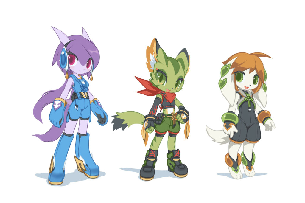
And because I disliked the Version 1 HD arts so much, I immediately began to experiment with different art styles, searching for a better solution. Finally in the middle of 2016, I created the Version 2 HD arts for the main characters.
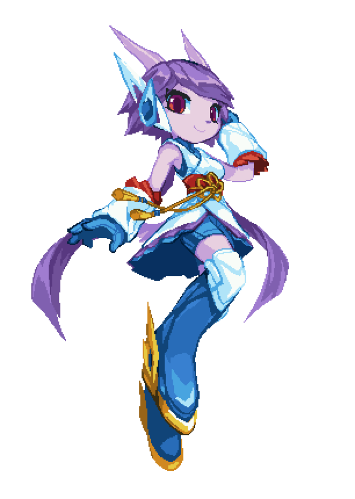
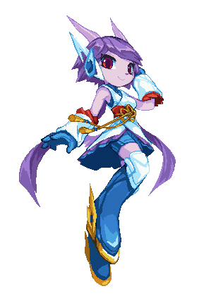
I wanted Lilac to look elegant and graceful. She is highly aerial and the fastest of the main four. I adjusted her horns, headgears, shoe decorations to make her look speedy and nimble. Maybe because of the shapes and colors of her armguards, gloves and long boots, she reminds me of Mega Man X.

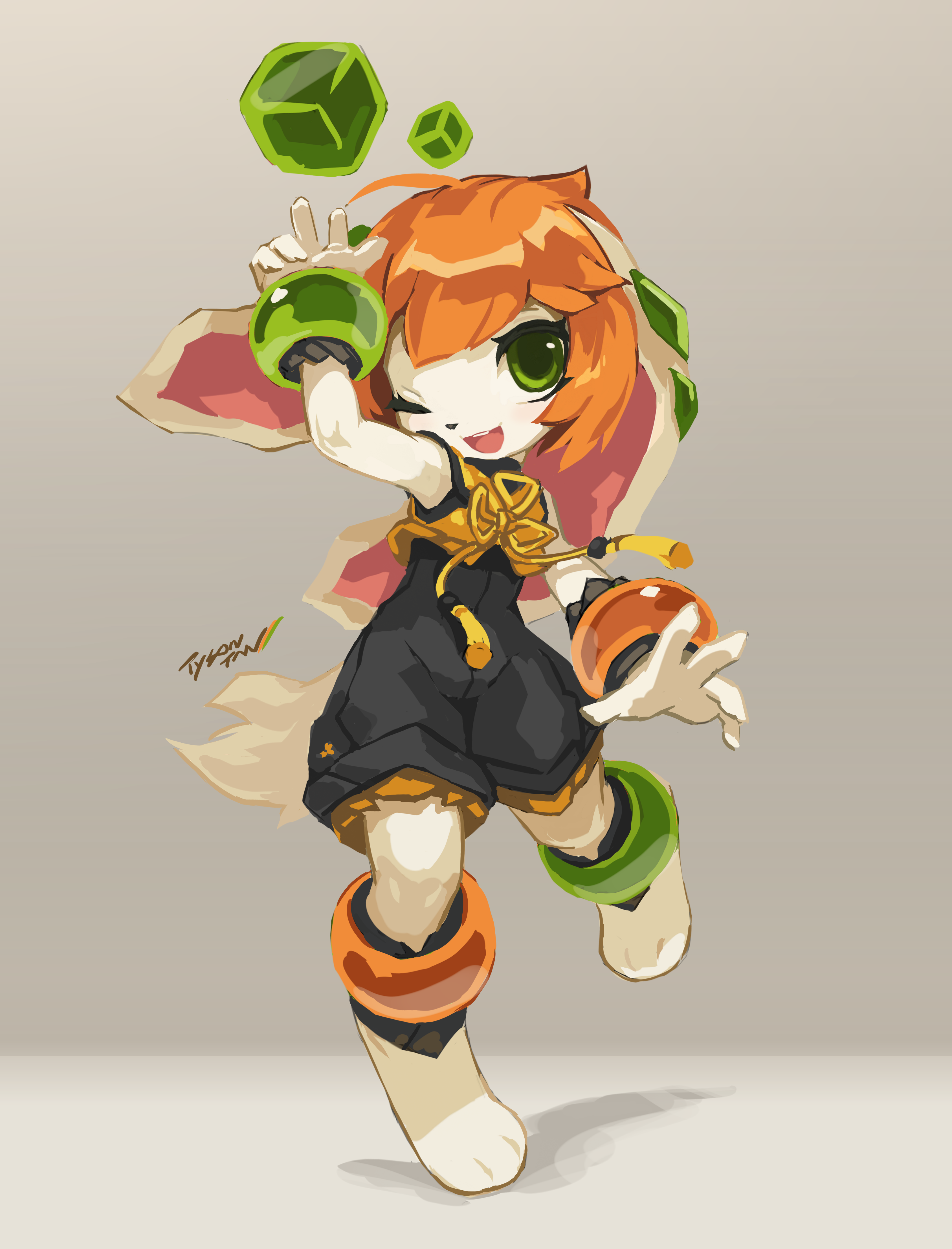
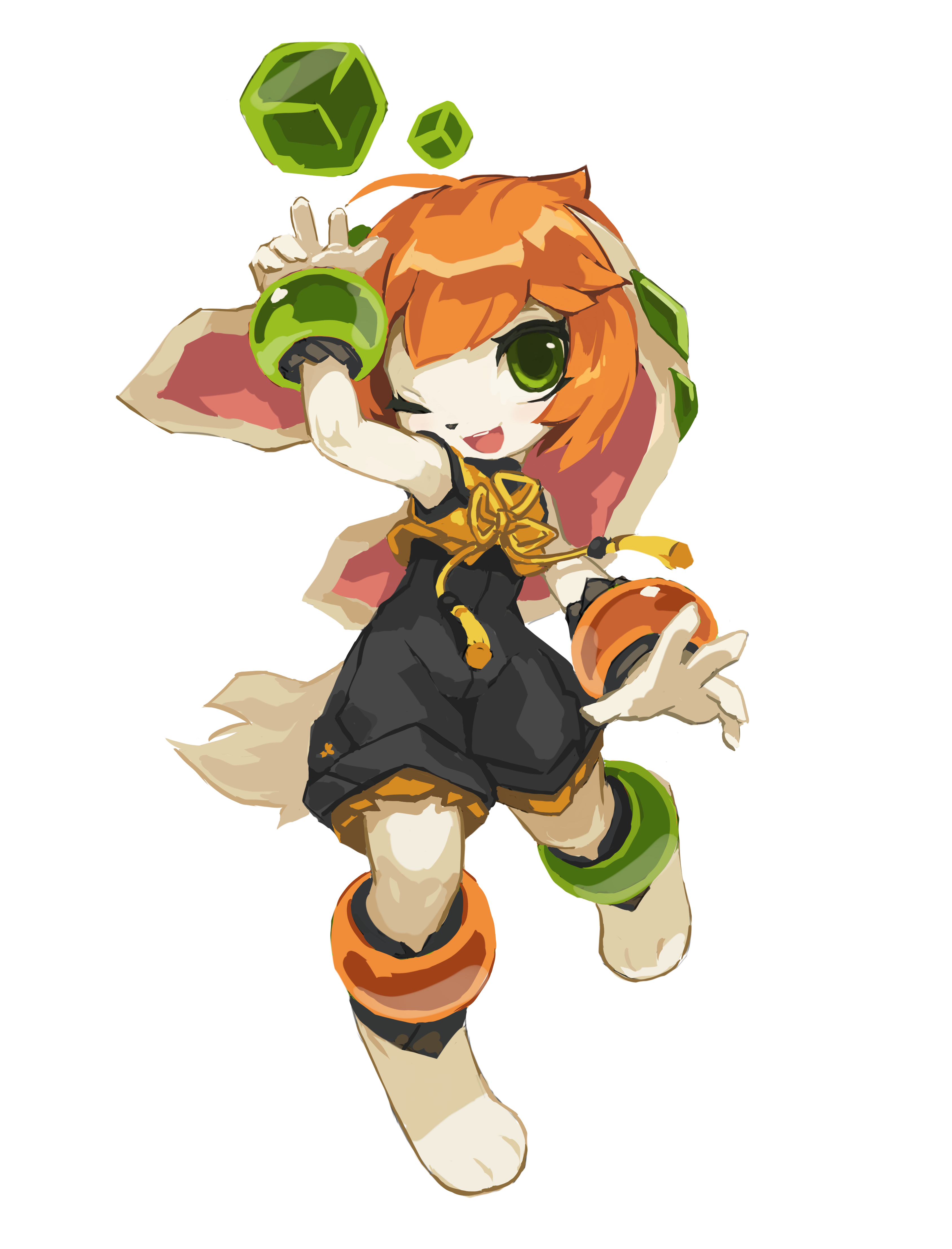
I wanted Carol to look rebellious and naughty. Her design is largely unchanged from Freedom Planet 1. I added reds all over her costume to correspond to her red scarf.
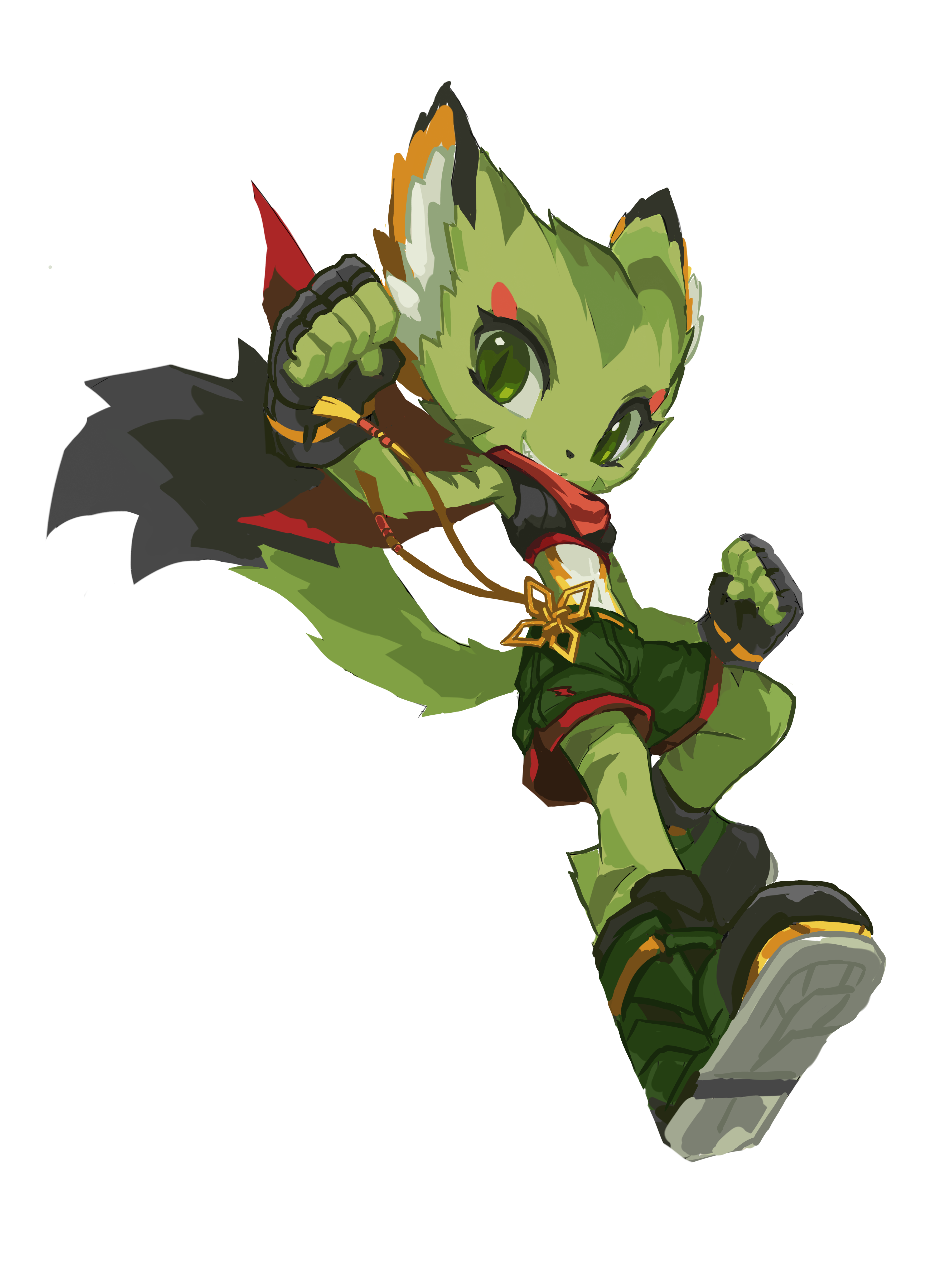
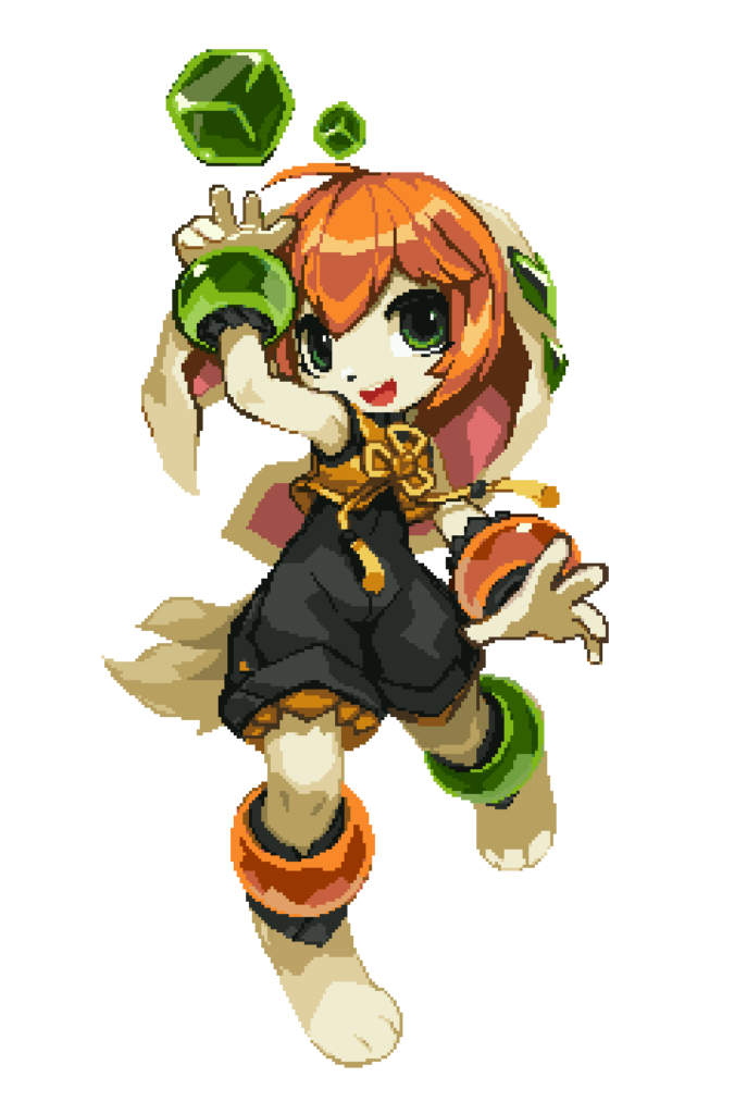
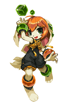
I wanted Milla to look cute and sporty. Her alternating odd color bracelets and the green pieces on her long ears are too iconic to be changed. But they are also too distracting, pulling viewer’s attention away from her face. I gave her a yellow crop top with a flower knot to draw attention back to the center. I also gave her a black romper to contrast with the yellows. The blacks also helped to supress her other flashy colors, making her design look more stable.
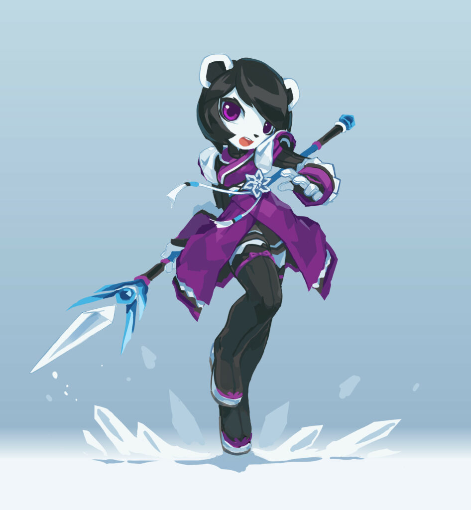
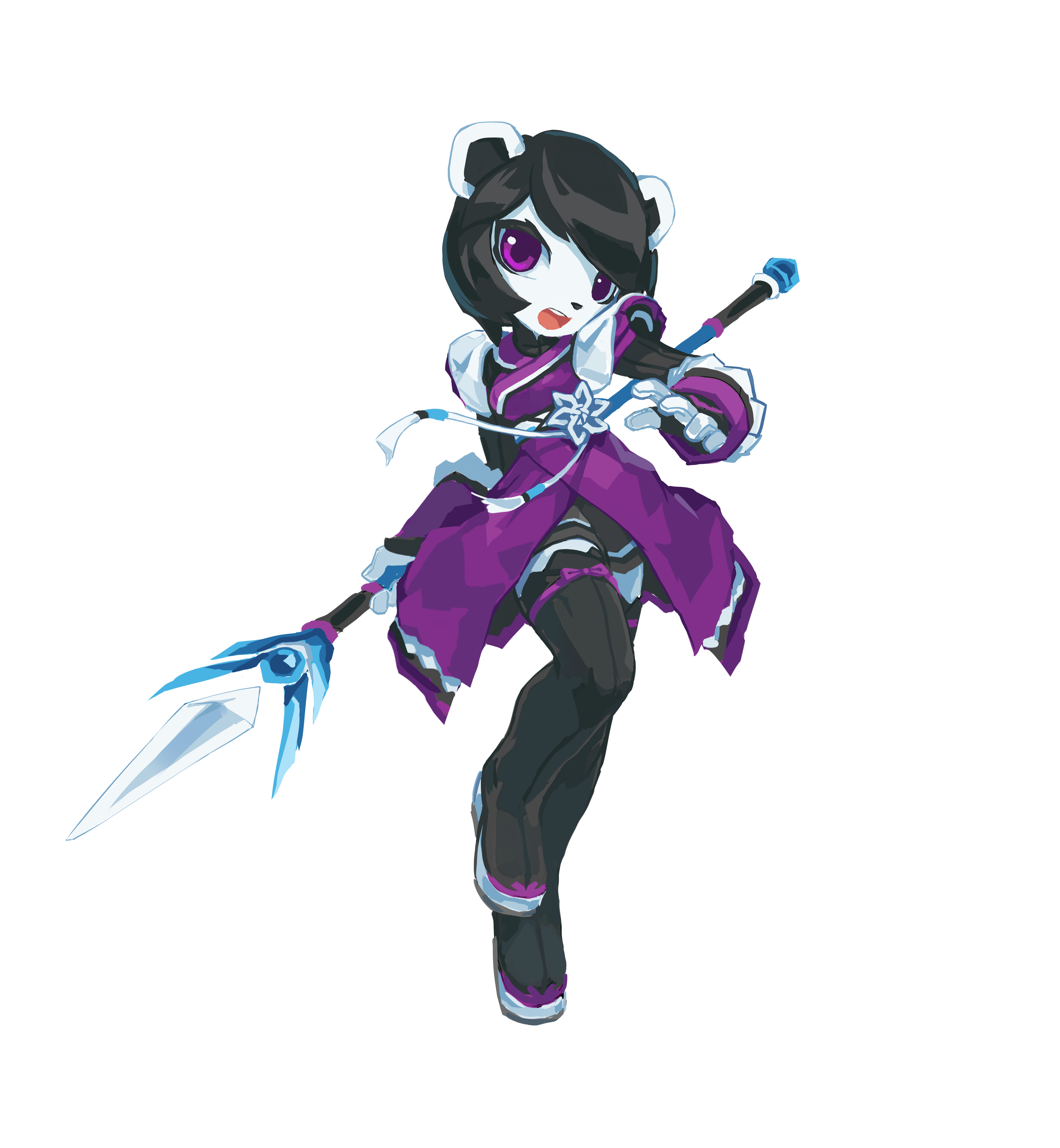
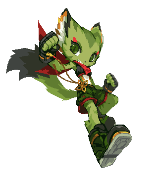
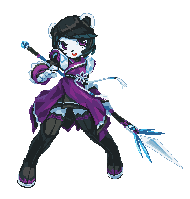
I honestly doubt Neera being a panda — she doesn’t have black fur around her eyes, and her ears are white. She looks like this since Freedom Planet 1. I treated her as a polar bear here — it makes sense because she uses ice magic, too. Her colors are mostly unchanged from FP1, but her white fur now has a cooler shade. Purples details were added everywhere to correspond to her purple dress. Her pose looks too similar to Lilac’s, so I redrew a new pose later when I was creating the pixel art version.
Pixel Arts Final
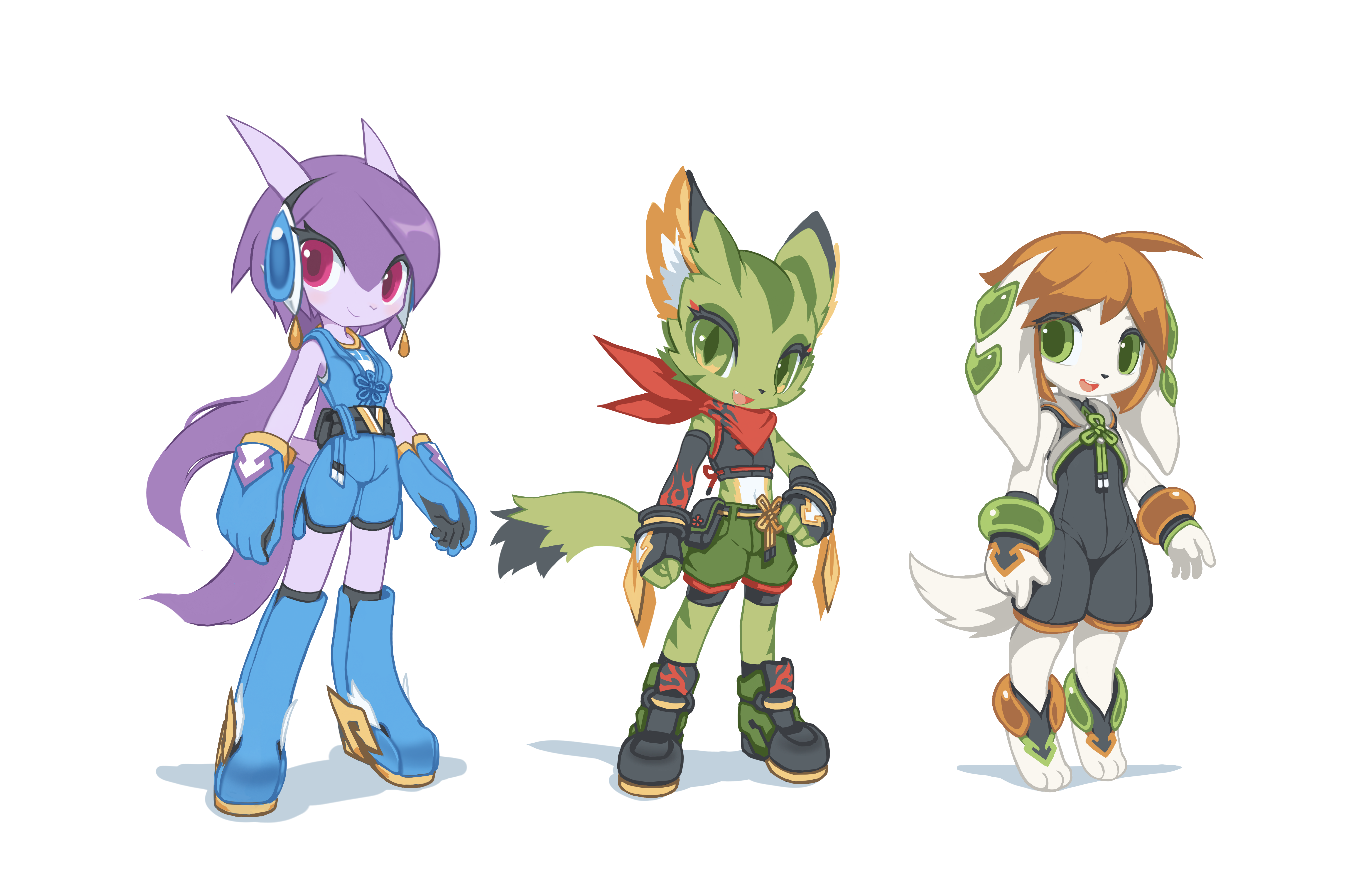
The pixel arts above were based on the Version 2 HD arts. They were used on the game’s character select screen. The pixel art version were created one year later in 2017, the colors, contrast, facial structures and body blocking received many improvements. I consider this to be the definitive version of the main girls.

Overworld Map Character Sprites
In 2020, I decided to hand-paint the game’s overworld maps. I also designed new character sprites to run over the maps. Although these sprites are much smaller than the stage sprites, they actually look more appealing despite the high-angle orthogonal view being more difficult to draw. The characters have more personality, and their body blocks are well-defined. My pixel art skill had come a long way, and I regained much control of my art in general at this point. These sprites are my personal favorite.
Conslusion
I didn’t prepared to work on a video game project like Freedom Planet 2. I was offer a chance to make use of my art skill, so I went with it. Unfortunately, the 7 years of the game’s long development span (2014 – 2022) overlapped with my low period as an artist (2012 – 2022). Bad things happened one after another in those years which really stressed me out. On top of that, I had to draw things I was unfamiliar with, all the time.
Suffice to say, I had a very difficult time in those years, both mentally and creatively. But the challenges pushed me to go through a mental transformation, and it also pushed me to improve my art skills. I think it was a meaninful life experiece. I changed for the better as a result, and I’m thankful for that.
Leave a Reply