
Libbie the Spirit Oryx, 3 Forms (2025) | Download Fullsize
This is the 2025 redesign of Libbie the Spirit Oryx. She was originally my entry for the cancelled Libreoffice mascot contest. In 2023, I repurposed her as a character in my original project “Spirit Animals in Disguise“, where she plays the head teacher of the main characters. In this article, I look back on Libbie’s 8-year design evolution, showcasing her iterations and the stories behind them.
2017: The Beginning
Libbie was originally designed as a candidate for LibreOffice’s mascot contest. LibreOffice is a free and open source office suite. However, the contest was cancelled due to the organizer’s misconduct, and Libbie never fulfilled her “original destiny”.
Due to this sad incident and my prolonged creative slump at the time, Libbie has always held a special place in my heart, as we endured those tough times together. For years, I wanted to repurpose her for my own project, giving her a home and a closure for both of us.
The 2017 mascot version of Libbie had a chibi proportion. It was unsuitable for my projects and needed a redesign. Libbie is meant to be a tall, mature office lady — a character type that I had zero experience with. At the time, my interests centered on Sonic and Pokemon, and I only drew young-looking characters. Many of my 2017 characters also appeared unusually short, chunky and stocky — likely due to artistic regression — though I was unaware of it back then. Plagued by these issues, most of Libbie’s redesign attempts failed.
2017: Early Attempts
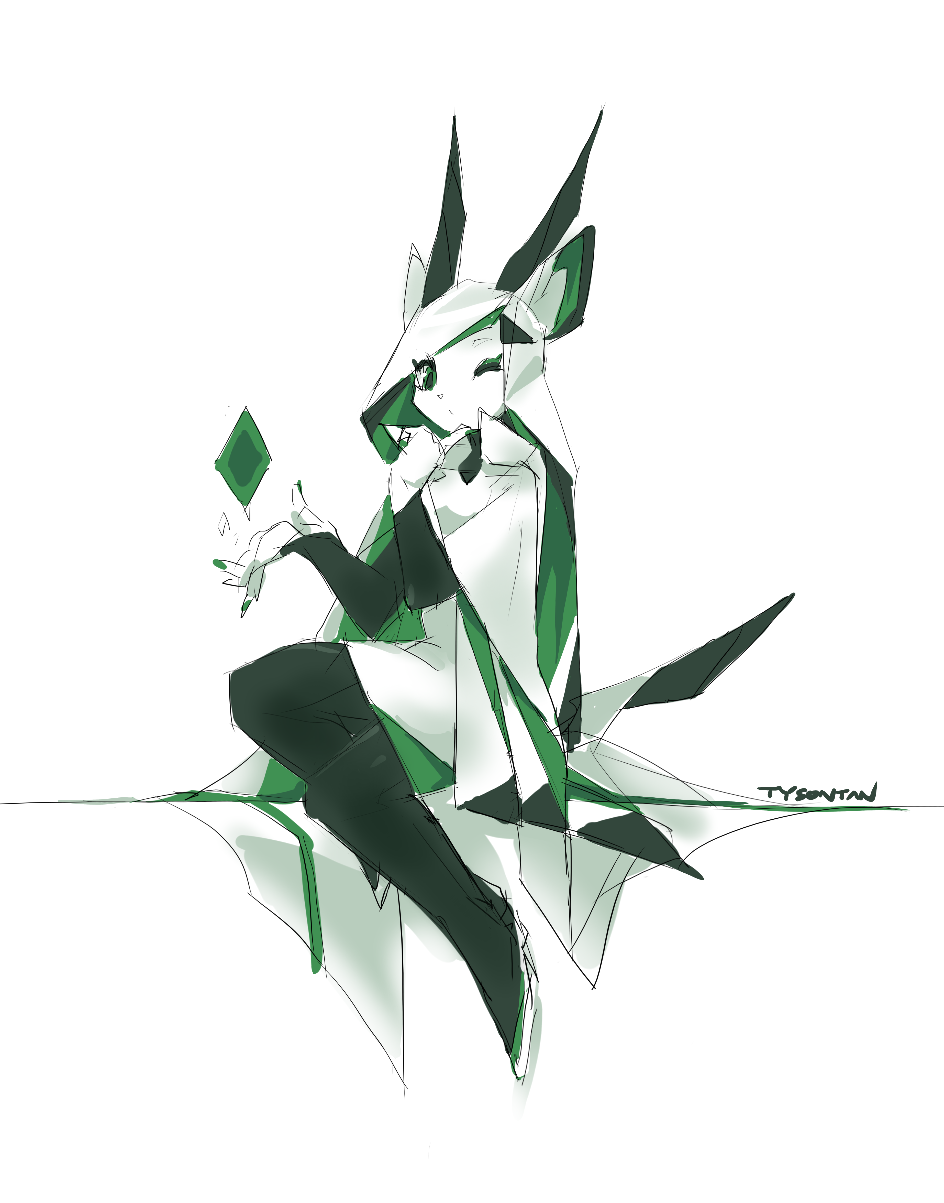
Interestingly, I actually sketched a normally proportioned Libbie prototype even before her chibi mascot version. However, I lacked the skill to draw her as intended, and was deeply embarrassed by the result. I quickly removed it from my gallery, and it remained forgotten on my hard drive until I redrew it in 2025.

After the LibreOffice mascot contest was cancelled, I sketched another normally proportioned Libbie. She looks cheerful and mischievous — perhaps meant to lift spirits after the incident. But the wound was still too fresh; I grew resentful and later removed it from my gallery. For years, I associated this piece with bad memories and believed it looked terrible.
However, reviewing it 8 years later, it doesn’t look as bad as I remembered. Aside from sketchy presentation and anatomical flaws, the character looks charming and the proportions match my original intent. I remember the drawing process to be rather relaxed and focused, perhaps that helped.
Sadly, my negative mindset at the time distorted my perception of this piece. Overlapped by a creative slump, I had no energy or skill to refine it further.
2018: Struggling

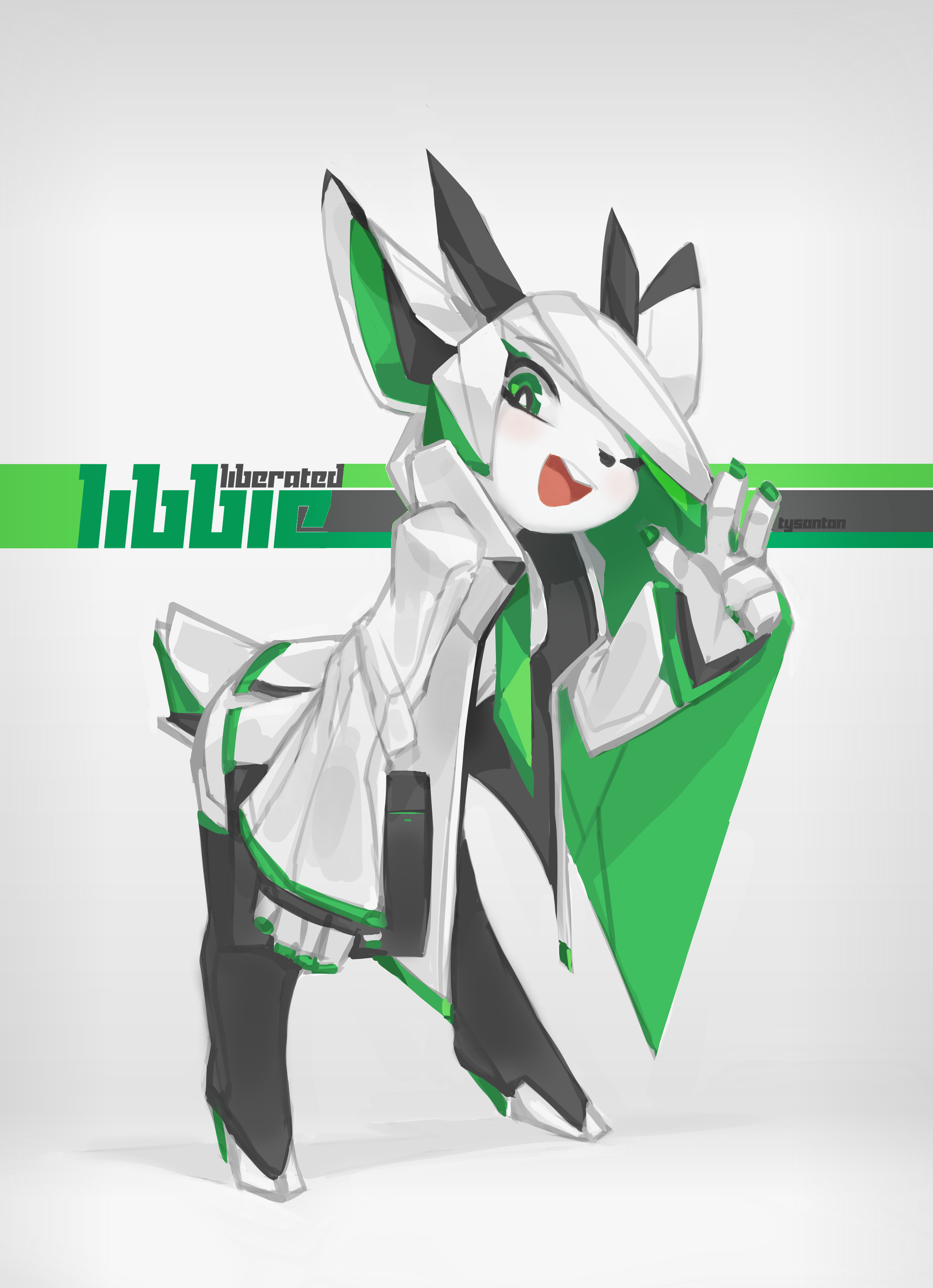
My art skills continued to decline, hitting rock bottom in 2018. Anatomy suffered the most: every character I drew exhibited some “shorty, chunky and stocky syndrome” — especially the 2018 Libbie. Unaware of my condition, however, I mistakenly thought I had successfully drawn a tall and slender Libbie, smugly calling her “a more liberated Libbie”.
The self-congratulatory delusion was short-lived. People did not react to the new Libbie as I had hoped. Since outside validation was my only source of self-worth, this hit hard. The old wound from the Libreoffice mascot contest hadn’t healed, either. Libbie’s forced smile here felt like a facede, giving me extremely bad vibes later. I eventually removed it from my gallery.
2019: Regroup and Reshape
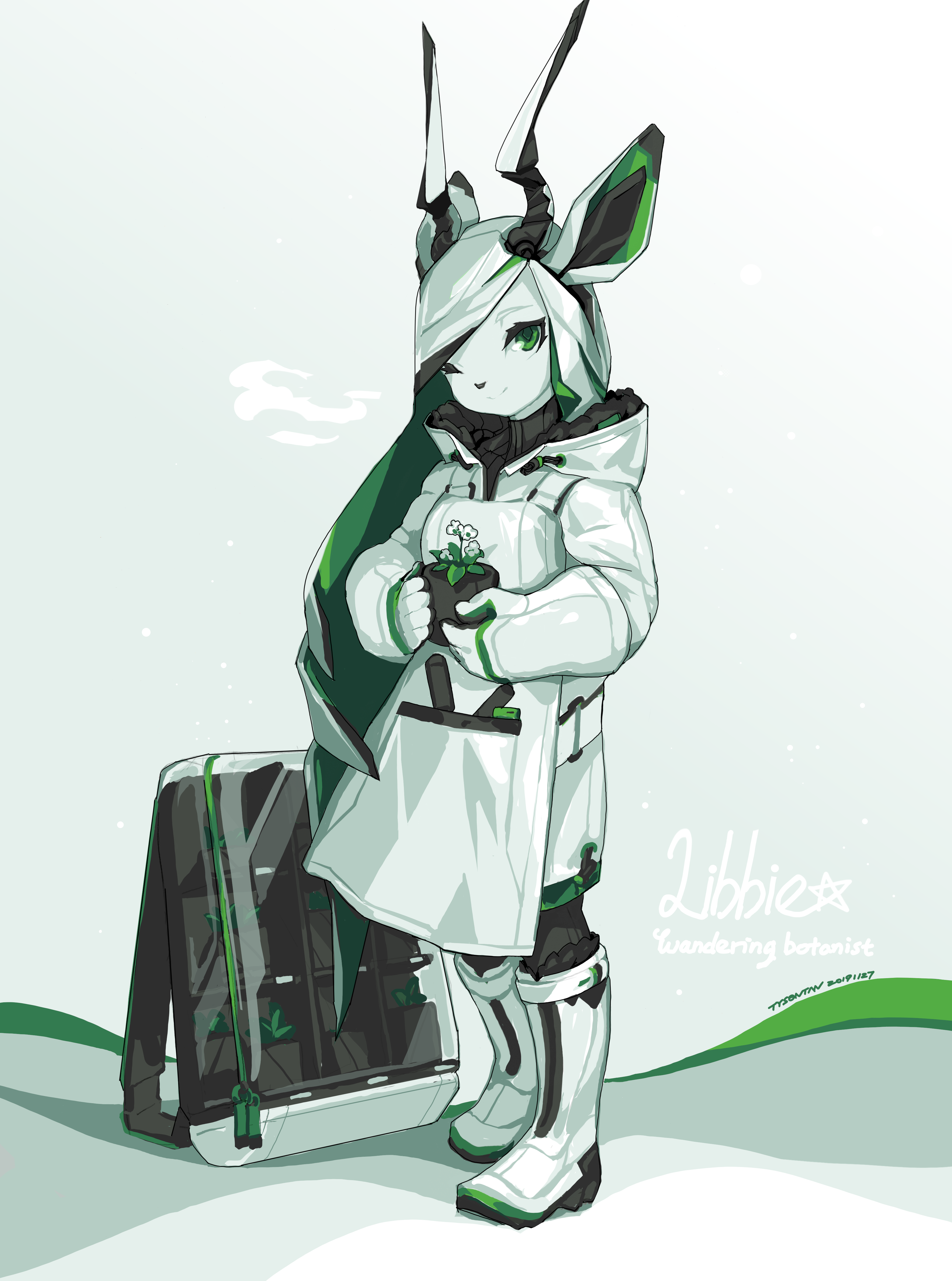
Unsatisfied with the 2018 Libbie, I drew her again in 2019. This time I used a standing pose with a head-scale to enforce the intended proportion. She now looks taller and slimmer, but still not enough.
Libbie was originally an office worker because of her Libreoffice association, but I wanted to explore other possibilities. In this version, I reimagined her as a botanist — likely inspired by her green accent color. I also designed her costume in techwear style, a trending style at the time, popularized by a certain gacha game.
My art skills had somewhat recovered by 2019, but the long creative slump had shattered my confidence. I was too cautious while drawing this piece, resulting in a stiff, unappealing result — especially the horns, which look haphazard. Over time, I grew critical of it and removed it from my gallery — like the previous ones.
Still, the 2019 version was the closest thing to a “finished” artwork I had made in years — a much needed confidence boost. It also inspired a new take on Libbie’s personality: more composed and modest, with playfulness now subtly layered beneath, reflecting her growth after the “incident”. Combined with her new agriculture-based profession, these elements would shape Libbie’s design later in Spirit Animals in Disguise.
2022: Overcompensate
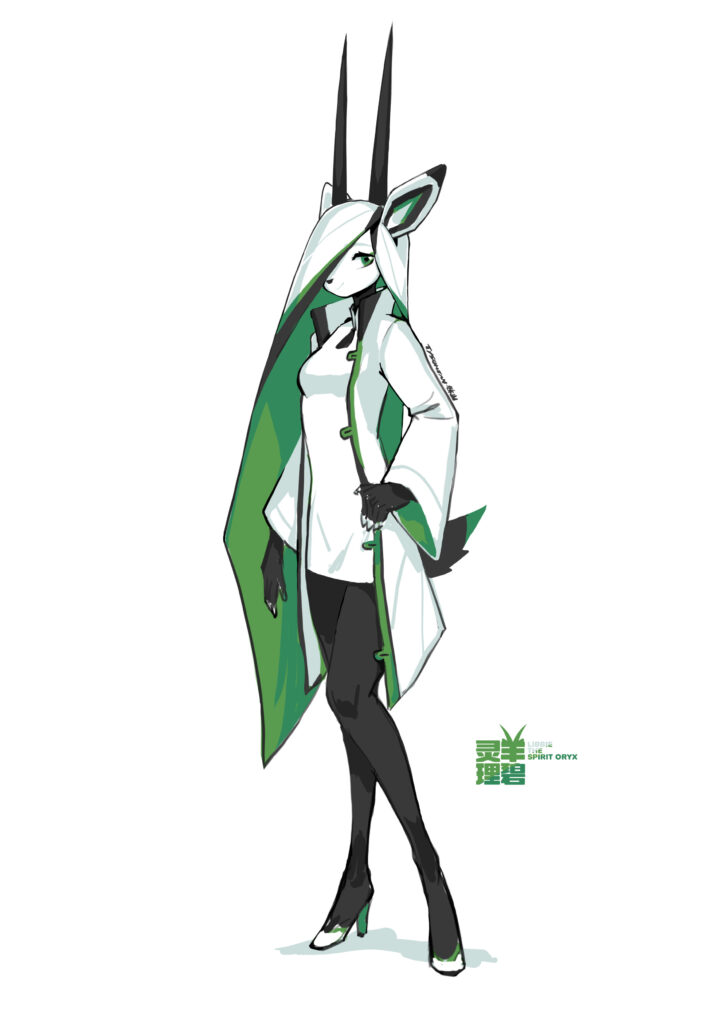
Over the years, I repeatedly tried — and failed — to draw Libbie as tall and slender. It became an full-blown obsession that I had to address. In 2022, I overcompensated by creating a super tall version of Libbie with a 7-head ratio.
Because I still lacked observation skills, I used a standing pose with a reference scale — like the 2018 version. While Libbie looked proper tall and slim this time, everything else suffered. Aware of its flaws, I never released the picture — only shared it privately with a few diehard Libbie fans. However, my mindset was better then; I didn’t blame myself for incompetence but viewed the 2022 version as a silly and pointless practice.
When writing this article in 2025, I cleaned up the 2022 sketch to make it more presentable. Because this cleanup happened after Libbie’s 2025 design, my improved art skill significantly enhanced the original sketch — especially in skull anatomy. The revised sketch is effectively a redraw and no longer an accurate reflection of my abilities in 2022.
In hindsight, this super tall design is not suitable for Libbie: the Arabian oryx is one of the heaviest antelopes, they are by no means “slender”. The extra height would also cause trouble when framing her with other characters. Although unused, the 2022 version was still a meaningful experiment in large head-to-body ratios — my first step towards more diverse characters.
2024: Not There Yet

By 2023, my creative slump had ended, and my art skills continued to improve.
In March, I designed Sachi the Spirit Fox as the mascot for Squishy, a free and open source project. Sachi has three forms: anthro, human and animal. I saw the potential in this concept, and used it as the base for my own project, Spirit Animals in Disguise.
In May, Leiting, Qiuye, and Mingzhu were created as the the project’s main characters. These kids are fifth graders. For their head teacher, I chose Libbie — reflecting the common Chinese metaphor of teachers as gardeners and students as flowers.
In 2024, I designed the first version of Libbie’s three forms. These captured her personality quite well, and I no longer had trouble drawing body proportions. Still, I was not quite satisfied with the result, so I created a second version in 2025.
Above is Libbie’s 2024 anthro form. Spirit Animal in Disguise is a fantasy slice-of-life comedy, so all sci-fi traits from her previous iterations have been removed. Her hair is now realistic locks; she has black limbs (like an Arabian oryx) and wears white gloves. She doesn’t have hooved fingertips in this version.
Because Libbie is now a primary school teacher, I prioritized modesty and practicality in her costume design. She now wears longer dress and a common lab coat without the distinctive collar from the previous iterations. I also gave her flat shoes because they are more comfortable to wear.
Above is Libbie’s 2024 human form. Although it was my first time drawing an adult human figure, the anatomy is basically the same as her anthro form and I had no trouble working on it. I like Libbie’s face and body proportions in this version, but not her costume or pose — they feel too stiff and ordinary.
The above is Libbie’s 2024 animal form. I had little prior experience with feral animal anatomy, making this form the weakest of the three. Libbie here looks more like a bull than an oryx, with an overly blocky head and body. The funny thing is, while drawing this form, I studied many Arabian oryx photos — yet my observation was still off. I really thought they look like bulls at the time.
Accurate observation is vital for artists. It can be practiced by copying (not tracing) VERY accurately from other’s work, or drawing from nature. I neglected it because I wanted to be “unique” and “original”. Ironically, this weakened my ability to draw even my imagination accurately.
At first, I was quite satisfied with the 2024 Libbie. But when I showed her to a few close friends, the reaction was lukewarm — “nice, but too safe and plain”. They missed her edge and charm — and they were right. Many of my character sketches at the time had the same problem. So I decided not to release them and instead practice more to improve.
2025: Feeling the Flow
In early 2025, I redrew several old pictures that I once regarded as major failures — Libbie’s 2017 prototype was one of them. These redraws had the same objectives: concept clarity, structure clarity, and visual appeal. I painted over the old design, iterated quickly with large color blocks, and cleaned them up as much as possible.
In this version, Libbie’s prototype design remains largely unchanged — just refined. I fixed the anatomy and improved perspective to make her look properly tall. Her head was completely redrawn to look more appealing. I also gave her a more composed expression. Overall, I think the 2025 redraw was a success, giving this memory a much needed closure.
Just as I began drawing more regularly, family events derailed my plan and kept me busy for months. I had little energy to draw, but I wrote down the frameworks for both of my projects. Libbie’s character profile became more fleshed out, giving me more inspirations for her redesign.
After settling the family matters, I began to redraw Libbie’s 2018 design. But fixing this old picture proved extremely difficult — it suffered severely from the “shorty, chunky and stocky” syndrome. In August, I scrapped the original base and drew a new one from scratch — resulting in Libbie’s 2025 anthro form.
Once the 2025 design was complete, I revisited the scrapped version: I had finished refining Libbie’s head, but everything below the chest remained only rough color blocks. I decided to complete it as an alternate version — retaining the original’s core concept — to bring proper closure to the 2018 failure.
Redrawing the 2018 version was an interesting experience. It deepened my understanding of anatomy and inspired future goals:
- Insight: Thigh axial rotation affects knee direction and everything below.
- Goal: Improve skull anatomy to draw proper animal snouts.
- Goal: Understand how high heels work.
- Goal: Draw more dynamic poses and compositions.
- Goal: Focus on the skeleton, not muscles.
- Goal: Clarity first — concept, structure, personality.
- Goal: Record time-lapses.
2025: Final Result

Now it’s time to introduce Libbie’s 2025 redesign. I drew her anthro, human, and animal forms simultaneously for consistency, finishing them in early October.
Libbie’s 2025 anthro form now features more recognizable Arabian oryx traits — sword-like horns, a prominent snout, striking body colors, and hooved fingertips. Her inner hair has changed from green to black for stronger contrast against her white body and easier outfit design.
Her new outfit has more elements from the 2017 prototype — the standing-collar coat came back, paired with a one-piece chinese dress and high heels. I had initially worried about Libbie’s comfort wearing heels all day, so I asked real-world women for advise. To my surprise, they all chose to prioritize beauty over comfort — without hesitation! While Libbie doesn’t need heels to appear taller, she does have better proportions with them.
As for her pose, I brought her gesturing hand forward to enhance depth by overlapping body parts. The composition also looks more dynamic as a result.
Libbie’s 2025 human form retains most elements from her anthro form. Her outfit features sleek, fitted half-sleeves — more appropriate for a teacher. It also uses light cool gray instead of bright white to complement her skin tone. She has no horns or tail in this form, so I gave her flowing black hair to make the composition more interesting.
Libbie’s 2025 animal form was the hardest to design. To avoid the 2024’s mistake, I compared photos of oryx, bull, goat, horse and golden takin — identifying the oryx’s most distinctive traits.
Because photos of Arabian oryx rarely include humans, I once saw them as large beasts like the Golden takin, leading to the bull-like misinterpretation in 2024. While among the largest antelopes (100 kg/220 lb; gazelles average 20 kg/44 lb), they are far smaller than donkeys (300 kg/660 lb). Although Libbie is a larger Arabian oryx (120 kg/264 lb, closer to a scimitar oryx), she should still appear goat-like, not bull-like.
Libbie’s 2025 animal form has a more tapered, feminine head that sharpens toward the mouth. Her body blends goat and horse features. Since she also works on the farm, I highlighted her bone structure and muscles to convey both agility and strength.
Libbie loves eating mint leaves, so I designed a “mint leaves” personal logo for her — featured on all her belongings. In her animal form, the chest logo also resembles an oryx head. In human form, she wears four spirit bands — two smart and two traditional, for redundancy. In anthro and animal forms, these bands transform into horn ornaments. Her pantyhose mimics the Arabian oryx’s black legs.
The New Art Style
Some may notice that the 2025 Libbie features thinner lines and cleaner colors than my earlier work. Before this, I often used thicker and fuzzier lines, like in this redraw of Milla. The main reason was laziness. That said, roughness could add a human touch, so I justified it as “artistic choice”.
The problem of a fuzzy art style is that I wasn’t in full control of everything. I observed and drew loosely, which hindered my growth as an artist. I hesitated to change because it was my comfort zone — until I discovered the work of a fellow furry artist (for certain reasons, I can’t say their name here).
This artist shares my anime/kemono style, but uses sharp, vector-like lines and minimal shading — yet their work feels vibrant and lively. They showed me a new possibility, inspiring me to learn from them.
The quest for a new art style started in April. I was not confident at first, but every piece following the fuzzy redraw of Milla showed greater clarity. By the time of Libbie’s 2025 design, I had finally reached my desired result.
Although thinner lines and minimal shading required more accuracy and planning, they also sharpened my art skills — enabling me to draw my ideas more accurately, focus better, and work faster.
While the new art style has benefits, I also understand it’s not going to work on everything, and the old fuzzy approach still has its use. I will keep refining both styles and aim to combine their strengths in future work.
Conclusion
Libbie’s 2025 redesign marked a much needed closure to her Libreoffice Saga. She evolves into a fully-fledged character for a new project, while I become a better artist myself. I will remember this eight-year journey not as setbacks, but as a meaningful life experience.
A few artworks in this article have time-lapses footage. I may compile them into a video later.
Leave a Reply